Thursday, March 28, 2024

Navigating the Data Science Seas: A Journey with Microsoft Fabric


Data science is a vast and exciting field, brimming with the potential to unlock valuable insights. But like any seafaring voyage, navigating its currents can be challenging. Data wrangling, complex models, and siloed information – these are just a few of the obstacles that data scientists encounter.

Fortunately, there's a trusty first mate to help us on this journey: Microsoft Fabric. Fabric isn't a single tool, but rather a comprehensive set of services designed to streamline the data science workflow. Let's set sail with an example to see how Fabric equips us for smoother sailing.

The mission of a data scientist is to develop a model to predict when a customer will stop using a service (customer churn). Here's how you can use Fabric can be your guide

Predicting Customer Churn

Let's dive deeper and explore the steps involved in building a customer churn prediction model using Microsoft Fabric.  You can get started by signing into http://fabric.microsoft.com  using your cruise tickets for your data science journey.

Step 1: Data Discovery & Acquisition

  • Mapping the Treasure Trove: Utilise Microsoft Purview, the unified data governance service within Azure Portal. Purview acts as your treasure map, helping you discover relevant datasets related to customer demographics, purchase history, and marketing interactions.  You can add your own datasets and register them.
  • Charting the Course: Once you've identified the datasets, leverage Azure Data Factory to orchestrate data extraction, transformation, and loading (ETL) processes. Data Factory acts as your captain, guiding the data from its source to your designated destination (e.g., One Lake). You can also avoid the above two steps and directly chart your course with the existing open datasets and notebooks available in the sea of Microsoft Fabric which is what we will be doing here.
  • Unveiling the Data in OneLake: As you navigate the vast seas of ocean (data), OneLake, a central data repository within Fabric, serves as your treasure trove. Utilise the Lakehouse item, your personal submarine, to explore and interact with the relevant datasets that are crucial for your customer churn prediction mission.  After signing in, enter into the Data Science cabin as shown in the below image


 We will be using an existing sample on Customer Churn that is available within Fabric.

Click on Use a Sample as shown below


Choose the Customer Churn Sample from the list of samples as shown below
 
This opens the customer churn notebook within the Fabric.


  • Attaching the Lakehouse to Your Notebook: Effortlessly connect the Lakehouse containing your relevant datasets to your analysis Notebook. This allows you to browse and interact with the data directly within your notebook environment. 
To do this click on lakehouse link section of the left navigation pane of the Notebook as shown below and create a New Lakehouse


  • Prepare for sailing: Bring the right luggage for sailing by installing the right libraries. To do this run the below code using the pip install command from the notebook as shown below
 

Prepare your travel documents by exploring the dataset that you are going to use which is the bank dataset that contains churn status of 10,000 customers with 14 attributes.  Run the below configuration to prepare as shown below


Prepare to combat seasickness by downloading the dataset and uploading it to the lakehouse by running the cell as shown below


  • Seamless Data Reads with Pandas: OneLake and Fabric Notebooks make data exploration a breeze. You can directly read data from your chosen Lakehouse into a Pandas dataframe, a powerful data structure for analysis in Python. This simplifies data access and streamlines the initial stages of your data exploration.
Prepare your groceries by running the next two cells and create a pandas dataframe as shown below


Plan your sailing itinerary by running the next two cells as shown below


Step 2: Data Wrangling & Preparation
  • Setting Sail with DataWrangler: DataWrangler, your powerful workhorse, welcomes the acquired data frame.  Here, you'll have an immersive experience to clean and prepare the data for analysis. This might involve handling missing values, encoding categorical variables, and feature engineering (creating new features based on existing ones).
Have the main mooring lines looped through to manouver by running the datawrangler from the Data tab of the notebook as shown below


Choose the dataframe that you created in the next screen as shown below


Now the Data Wrangler is launched, expand the find and replace and click on the drop duplicate rows as shown below


This will create the code for dropping the duplicate rows from the dataframe if there are any as shown below


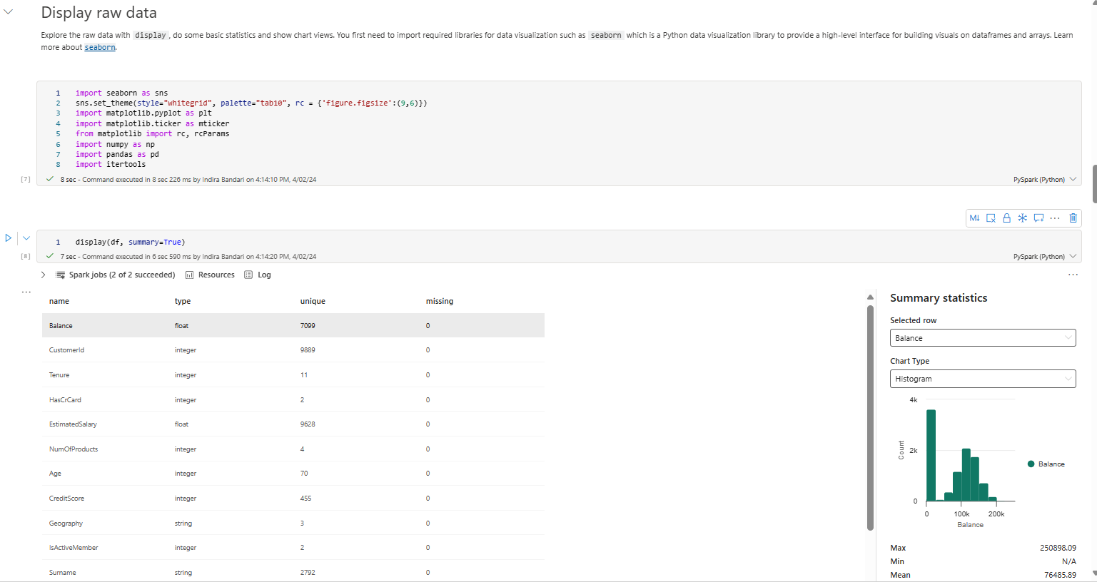
  • Exploring the Currents: Perform Exploratory Data Analysis (EDA) to understand the data's characteristics. Identify patterns and relationships between features that might influence customer churn. 
Start moving only after checking that no other boat is already manoeuvring in the same channel arm by running the next three cells as shown below 


Also run the five number summary as shown below


Explore further by running the distribution of the exited and non exited customers as shown below


Run the distribution of numerical attributes


Perform feature engineering and one hot encoding


As a final step of Exploratory data analysis create a delta table by running the delta table code as shown below.  You can also see the delta table named df_clean created in the lakehouse.


Step3: Building & Training the Model
  • Choosing Your Vessel: Azure Machine Learning serves as your shipbuilder. Here, you can choose and configure a machine learning algorithm suitable for churn prediction. Popular options include Logistic Regression, Random Forest, or Gradient Boosting Machines (GBMs).

Run the code in Step 4 of the notebook as shown below that will load the delta table and generate the experiment.
 
Now run the code that sets the experiment and auto logging, imports the scikit learn libraries and prepares the training and test data as shown below
 

  • Training the Crew: Split your prepared data into training and testing sets. The training set feeds the algorithm, allowing it to "learn" the patterns associated with customer churn.

Now apply SMOTE to the training dataset and run the below query
 
Now train the model with Random Forest as shown below


Train the model with LightGBM too as shown below


  • Fine-Tuning the Sails: Use hyperparameter tuning techniques to optimize the chosen algorithm's performance. This involves adjusting its parameters to achieve the best possible accuracy on the training data.
Track the model performance by observing the model metrics as shown below
 
Step 4: Evaluation & Deployment
  • Testing the Waters: Evaluate your model's performance on the unseen testing data. Metrics like accuracy, precision, and recall will tell you how well the model predicts churn.
Load the best model and assess the performance against the test data as shown below
 
  • Refinements & Improvements: Based on the evaluation results, you might need to refine your model by trying different algorithms, features, or hyperparameter settings. Iterate until you're satisfied with its performance.
Check the confusion matrix results as shown below
 
  • Deploying the Model: Once the model performs well, save the prediction results to a delta file in the Lakehouse.
Save the results into the lakehouse by running the code as shown below
 

Step 5: Visualization & Communication
  • Charting the Future: Leverage Power BI, seamlessly integrated with Fabric, to create compelling visualizations of your churn predictions. Segment customers based on their predicted churn probability, allowing for targeted interventions.
An example screenshot of the Power BI Visualisation is as below
 

  • Sharing the Treasure: Communicate your findings to stakeholders. Use Power BI dashboards to showcase the model's effectiveness and its potential impact on reducing customer churn.
This blog post demonstrates how Microsoft Fabric acts as your comprehensive toolkit, guiding you through the entire customer churn prediction journey!


Friday, March 03, 2023

Deploy the Azure Machine Learning Model

In the previous post I have discussed how to create an Azure Machine Model.  In this post I will be discussing how to Deploy this model.

Prerequisites

Before deploying a machine learning model in Azure, there are several prerequisites you need to fulfill:

Prepare your data: You should have a well-prepared and cleaned dataset that has been tested and validated.

Select your model: You need to choose an appropriate machine learning algorithm based on your problem statement and the nature of your data.

Train your model: You need to train your machine learning model on your prepared dataset.

As you must have seen we have undertaken all these steps and have trained our model in Azure Machine Learning in the previous post.


As part of training the model, we have created an inference pipeline.  Now if we want to deploy the model, we need to create a real time inference pipeline.

In order to do that, in the Azure Portal launch the Azure Machine Learning studio as shown below.


Monday, February 27, 2023

Create a Predictive Model in Azure Machine Learning -- Designer mode

Today after a long time, I wanted to play around with Azure Machine Learning Designer formerly Machine Learning Studio.  

So I set our to create a Predictive Model using the Sample data that is available in Azure ML -- Automobile price data (Raw)

So I logged in to Azure Portal -- 


Creating a Machine Learning Workspace

The first step is to create a Machine Learning Resource -- 

So for that Click on Create a Resource Button and search machine learning as shown below:


Click on Azure Machine Learning

The below screen appears. 


Click on Create.  The below screen appears.


Fill in the Resource Group, Workspace Name and Region details.

Fill in other details in the other tabs if needed and click on Review and Create

Now the Azure Machine Learning Workspace is created as below


Click on the Name of the AML workspace

The below screen appears.


Click on Launch Studio.  This will launch the Azure Machine Learning (AML) interface.

Click on the Create New -- This opens up the Menu of what can be created as shown below.


Ingesting Data

Click on Pipeline.  This will create a New Pipeline Menu as shown below


As you can see it uses the Designer Authoring tool.  Now Click on the Plus button which is Create a pipeline using classic pre-built components.

This will open a blank canvas in the designer as shown below:


Now we are ready to create a training model.  Click on the two arrows beside Undo as shown in the above image.  This will open a Menu which contains the components that can be used to build the predictive model as shown below:


Click on Sample data and drag the dataset named Automobile Price Data (Raw) on to the blank canvas


You can right-click the Automobile price data (Raw) component and select Preview Data to understand the dataset. 

Each row corresponds to an automobile, and the variables associated with each automobile appear as columns. There are 205 rows and 26 columns in this dataset.


Preparing Data


Now that we have chosen the dataset we need to clean the data. 
First step in preparing data is to eliminate columns that we do not need 
Second step is to remove the missing values.  

So if you look at the dataset carefully, there are many values missing from the column normalized-losses.  So we need to eliminate this column.  To achieve this, we can use the Select Column in dataset component as shown below.


Now connect the Dataset component with the Select Columns component.


Double click on the New component and choose Edit Columns and create the rules as below to Include All columns Except the column named  normalized-losses


Next step is to remove other missing values.  For this we will use the Clean missing data component.  Drag this component to the Canvas.  Connect the Select columns dataset component to the Clean missing data component as shown below.

Double Click on the Clean missing data component and change as shown below.


Preparing Training and test data
Now that we have prepared and cleaned the dataset, the next step is to prepare the train and test data,  For this we will use Split Data component.  Search for the Split Data component and drag it to the canvas.  Connect the Clean Missing data component to the Split Data component.  Make sure that the Cleaned dataset port is connected as shown below.


Double click the Split Data component and configure as shown below. The 0.7 in the Fraction of rows in the first output dataset. means that the dataset will be split into 70% and 30%.  The 70% dataset will be used for training a model and 30% dataset can be used as a test dataset.


Training a Model
The Next Step is to train a model.  From the data we are going to Predict the Price of the automobile.  So we will use a linear regression model.  So Search for the Linear Regression component and drag it to the canvas.  Next search for a Train Model and drag it to the canvas.  And connect these components as shown below.


Scoring and Evaluating the Model

Next add the components -- Score Model and Evaluate Model on to the canvas and connect them as shown below:


Now your Pipeline is ready.  

Next Steps --- 
In order to train this model, you need to click on the Submit button


Once you submit you will be prompted with the below configuration.


Ensure that you have configured the Compute Target as well as shown below


This will create a pipeline job and a notification will pop up at the top right corner of the page.   Since this is your first job, this might take up to 20 mins to run.  Once you get the notification that the job is completed, you can look at the job detail page as shown below.


You can then look at the scored labels and price predicted as shown below.


You can use the Evaluate Model to see how well the trained model performed on the test dataset as shown below


You can see the error statistics above.  For each of the error statistics, smaller is better. A smaller value indicates that the predictions are closer to the actual values. 

For the coefficient of determination, the closer its value is to one (1.0), the better the predictions.


That's it from me for today.

In my next blog post I will show you how you can deploy this model.


Tuesday, November 22, 2022

Create a Lollipop Chart in Power BI -- Without the use of any Custom Visuals

 I have been playing around with the newly launched Error Bars functionality in Power BI.  The result is this Blog Post.  Here I am going to explain how you can create a lollipop chart in Power BI without using any custom visuals or charticulator or deneb 

Step 1:  

Create a simple line chart -- I have sales data and region data.  So I created a line chart as shown below.


Step 2:  

Format the line chart to remove the line as shown below.  Click on the format icon -- Visual tab -- Line -- Stroke Width -- Change from 3 px to 0


The result of this action is -- the line will entirely disappear as we changed the Stroke Width from 3 px to 0 px.


Step 3:  

Add Markers as shown below and ensure that the shape is a circle resembling the ball of the lollipop and increase the size to 10 px to get reasonable sized balls


The result is as shown below.


Step 4:  
Ensure that the Data Labels are Enabled and choose Position as Above as shown below
You can disable Y-Axis if you need to.  


Step 5:  
Here is where we will be using the Error Bars to add the Line to show the lollipop stick.
To go to the Error Bars section -- Go to the Further Analytics icon and click on Error Bars.
Enable the Error Bars.  As shown below it needs an Upper Bound and Lower Bound.  Upper Bound can be Sum of Sales and the Lower Bound is always 0 (Zero).  Since there is no way to input a number, let us create a Measure that returns 0 .  
The new Measure is -- Lowerbound = 0
 

Step 6:
You can see faint lollipop lines.  You can increase the width of the line by clicking on the Bar and changing the Width as shown below


And Viola!  Your Lollipop chart is ready!

Hope you liked this Step by Step instruction on creating the lollipop chart.


Navigating the Data Science Seas: A Journey with Microsoft Fabric

Data science is a vast and exciting field, brimming with the potential to unlock valuable insights. But like any seafaring voyage, navigatin...